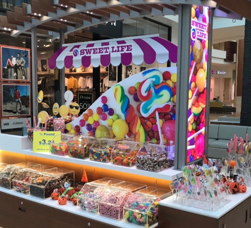
Retail Merchandising Units (RMUs) can be used to attract customers in bustling shopping centres and malls, however, with limited space to make a significant impact, designing an eye-catching RMU display requires creativity, strategy, and a keen understanding of visual merchandising principles. In this article, we will guide you through the essential steps to create a compelling RMU display that not only grabs attention but also drives sales.
1. Understand Your Audience and Products
Before you begin designing your RMU display, it’s essential to have a clear understanding of your target audience and the products you are promoting. Are you appealing to a younger demographic or a more mature audience? Are your products high-end or budget-friendly? Understanding these factors will help you tailor your display to the tastes and preferences of your potential customers. For instance, a display targeting teenagers might use vibrant colours and interactive elements, while a luxury brand might opt for a more minimalist, elegant design.
2. Maximise Visual Impact with Bold Graphics and Colours
In a crowded retail environment, your RMU display needs to stand out. One of the most effective ways to achieve this is through the use of bold graphics and eye-catching colours. Choose a colour palette that reflects your brand identity and resonates with your audience. Make sure that your graphics are clear, high-quality, and easily visible from a distance. Consider using large, high-resolution images of your products and vibrant signage to draw attention.
3. Optimise Layout and Flow
The layout of your RMU display is crucial for guiding customers through your offerings. A well-thought-out layout should create a natural flow, leading customers from one product to another seamlessly. Place your best-selling or most eye-catching products at eye level, where they are most likely to grab attention. Use the limited space wisely by grouping similar products together and avoiding clutter. Remember, a clean and organised display is more appealing and easier for customers to navigate.
4. Incorporate Interactive Elements
Interactive elements can greatly enhance the appeal of your RMU display. These could include touch screens showcasing product videos, QR codes linking to online content, or even product samples for customers to try. By engaging customers' senses and encouraging interaction, you create a more memorable experience that can increase dwell time and boost sales. Just ensure that these elements are intuitive and do not overwhelm the display.
5. Highlight Promotions and Offers
Promotions and special offers are excellent tools to attract customers to your RMU display. Use clear and bold signage to highlight any discounts, bundle deals, or exclusive offers. Consider using bright colours like red or yellow for these signs to make them stand out. Additionally, strategically place promotional items near the front of the display to entice customers to stop and explore further.
6. Ensure Brand Consistency
Your RMU display should be a reflection of your brand’s identity. Ensure that your logo, colours, fonts, and messaging are consistent with your overall branding strategy. This consistency helps in building brand recognition and trust among customers. Additionally, a cohesive brand image across all your displays and marketing materials creates a more professional and polished look.
7. Utilise Lighting Effectively
Good lighting can make or break your RMU display. Proper lighting can highlight key products, create ambiance, and draw attention to your display from afar. Consider using a mix of ambient, task, and accent lighting to enhance the visual appeal of your display. LED lights can be a great choice as they are energy-efficient and come in a variety of colours and brightness levels. Avoid harsh lighting that could detract from the overall experience.
8. Keep It Fresh and Seasonal
Regularly updating your RMU display is essential for maintaining customer interest. Consider changing your display to reflect seasonal themes, holidays, or special events. Fresh displays not only attract repeat customers but also give you the opportunity to showcase new products and promotions. Plan a schedule for updating your display and keep an eye on current trends to stay relevant.
9. Test and Evaluate Your Display
Finally, don’t forget to test and evaluate your RMU display. Observe customer interactions and gather feedback to identify what works and what doesn’t. You can also conduct A/B testing by changing one element of your display at a time and measuring the impact on customer engagement and sales. Use this data to continuously improve your display design and maximise its effectiveness.
Designing an eye-catching RMU display involves a strategic combination of understanding your audience, maximising visual impact, creating a logical layout, and ensuring brand consistency. By following these steps and continuously evaluating your display’s performance, you can create an engaging and effective RMU display that draws in customers and boosts sales.
Keywords: RMU display design, eye-catching retail display, visual merchandising, retail merchandising unit, interactive elements in RMU, maximise visual impact RMU, brand consistency RMU display, seasonal RMU display, retail display lighting, RMU layout optimisation.


